Owner
A restaurant owner needs to stay on top of all the business-related activities and that’s where the Quantic report comes in handy. Do you think you have enough time to spend updating the numbers on the excel sheet? Well, we have a great alternative. Quantic Reporting provides you with accurate information about your business’s well-being through intuitive bar graphs and charts.
Quick reporting on the Dashboard

Your Quantic back-end Dashboard displays all the essential information that you need to be well informed about all the business-related activities. It opens up as you log in to your back-end portal.

On the top, you will see Gross Sale and Net Sale data for open orders (unpaid ones). It gives you an estimate of how much business will happen at the end of the day.The other data includes Total Orders that you served and Total Guests you received under a particular date range.
Graphs and charts
The Sales by Super Category chart has been created to let you track revenues from various groups in your restaurant. The basic super categories in a restaurant are Food, Alcohol, Beverage/Non-Alcohol, etc. You can track the revenues generated by each Super Category via a pie chart. It clearly shows different Super categories through different colors.
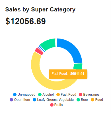
Also, you can hover the cursor over a particular Super Category to check the revenue it has generated. As seen in the screenshot, Fast Food has generated $6511.61 during a particular date range.
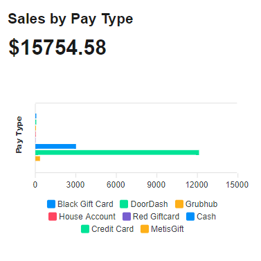
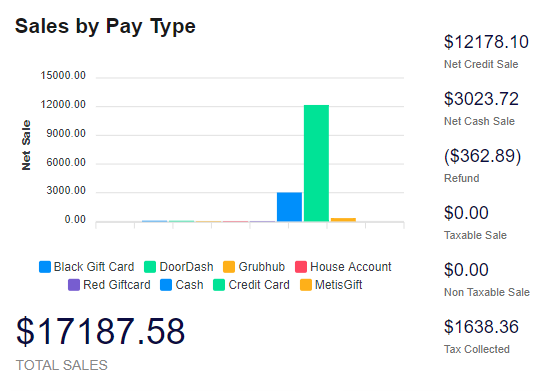
Sales by Pay Type is another essential graph that displays the type of payment method used to pay for an order. The color coding is used to clarify each Pay Type. You can also hover your cursor over any Pay Type to get a glimpse of how much revenue it has generated.Some common examples include credit cards, Metis Gift cards, etc.
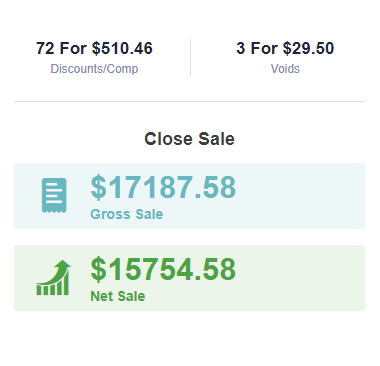
The data at the center-right shows a couple of information. As seen in the screenshot, you can see the total Discounts/Comp offered along with the amount.Also, you can see the orders voided along with the total number of voids and the amount.Closed Sale displays the actual sale or the customers have paid for these orders.
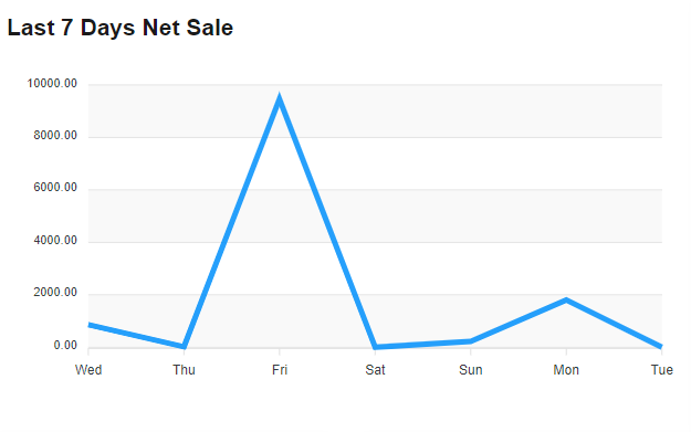
As the name represents, the Last 7 Days Net Sale shows the sales dynamics in the past 7 days. You can see the lucky days when your sales soared up. It can help you make wise business decisions such as:
- Which day nobody should take a week off.
- The days when highly efficient manpower should present on important counters.
- Identifying the low volume days and offering special discounts on those days. Like Saturday Special 20% off, etc.
Here is another graph that you can see under the Reports section. It displays the net credit sale and net cash sale for a particular date range.You can also see the amount refunded, taxable sale, non-taxable sale, and the tax collected on the sidebar.Do you offer gift cards at your restaurant? You can use this graph to check how many transactions have been made using these gift cards which can help you make some strategic decisions.